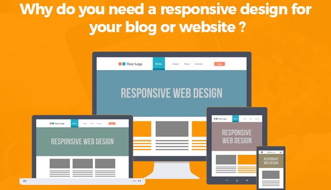
Responsive design is an approach of developing a website that makes it compatible to work on any device such as a laptop, tablet, mobile phone or TV. Your blog or website will appear in a proper format on any device: a desktop computer, a tablet or a mobile device.
Most of the people are using mobile devices such as Smartphones and tablets for every work that used to be only accomplished using desktop.
A website built with responsive design flaunts consistently, whichever device or screen size a visitor is using, doesn’t matters. It looks the same whether you view it on your smartphone or on your computer.
Responsive web design uses CSS, HTML and sometimes javascript to grow, move, hide, shrink and show elements based on the users’ device.
Current Google reports states more than 61% of mobile visitors who go through to a website which is non–mobile-friendly return back to Google to find a website that’s more efficiently readable from their device. It’s become demanding to have a responsive design for companies.
Mobile devices such as tablets and Smartphones are in high demand for internet surfing. It’s not just surfing but all other things from checking emails, browsing social media outlets, and online shopping. Because of the rapidly increasing mobile Internet usage it is exceedingly important that your website is mobile friendly.
Techniques to Make Your Website Responsive
Flexible Design
Flexible design means to shift from fixed size to flexible sizes. Shifting to flexible sizes allows the web page to enlarge and shrink with the browser on the basis of its percentage, hence making the website responsive.
Active and Adaptive Images
Making your images quick and responsive is a very vital step, as it can affect both your websites quickness and its search engine friendliness. Responsive Images enlarge and shrink as per the browser to fit the web page of the user.
Using a large image both in file size and pixels can take a long time to load on the device connected to slower internet connections. Same as flexible design Adaptive Images set up a high response, Adaptive images allows to adapt to its parent container.
Media Queries
Media queries is an unique technique which allows to add device specific rules for screening, developing, showing or moving content for a better user experience.
Advantages of Responsive Design for your Website or Blog
Highly Increasing Demand in Mobile Usage
At present number of mobile devices on earth are more than people, and mobile usage is rapidly increasing day-by-day.
Shopping on mobile devices is rapidly growing as it is easier to shop online rather than hopping and driving to the store in car. More than 75% of the consumers use their Smartphones on a daily basis to shop online. Customers with more and more expectation will view your website from a mobile device.
It they get poor experience viewing and interacting with your site, it will result in the decrease of your business and brand.
Social media is an important aspect for the increasing demand in the mobile usage. Shoppers use social marketing strategy for attracting the customer to their websites.
Increase in Conversion Rates
It is the ability of the responsive design that all coveted conversion rates from all of the mobile users can be increased. Being flexible and adaptive a responsive website design can fit to any screen.
How all of those conversion elements will display on mobile and tablet is managed and controlled by developers. High-end heat mapping and A/B testing is also allowed by the responsive design. You can get a better picture of how users are interacting on your website by segmenting users with their mobiles.
By following this techniques, you can identify what sales tactics, marketing plans and approach are effective or not and with the help of this information you can find out a way to increase conversion rates.
Responsive Design Provides Better User Experience
Responsive design flaunts consistently, the content adjusts automatically on the screen of the device. Zooming and shrinking the contents (texts or images ) can lead to a poor user experience. Responsive design makes it more conducive and comfortable for users to read and operate your website.
A better user experience makes it more convenient for users to be reached, with their valuable feedback you can make changes as per the demand which leads to the increase in business.
Highly Adaptive
Responsive designs are highly adaptive. It provides and offers tailor-made solutions. Responsive design adapts to the user capabilities and needs. It is more compatible to the modern user experience, as it adapts to any screen size.
Responsive design with adaptive features provides a high speed and fastest website loading experience to the users. It increases the demand of users visiting the website.
Responsive Website Improves SEO Efforts
A user friendly and focused experience on your website and a best quality content can increase the demand of users on your website for a long time which results in the increase in dwell time.
A responsive website design is always recommended by Google which results in good user experience and improves the SEO efforts across all different platforms. It’s not good for a business for both Google and website not taking the benefits ans advantages of the responsive website design.
Lower Cost and Website Maintenance
The most important aspect and feature of a responsive website design is it offers you a lower maintenance cost as you handling two separate version of the same website.
With a responsive design the site will adapt to any device whether it is a laptop, desktop or mobile devices. It makes you to update the contents once and to manage only one site.
Such a nice post, keep providing good resources.
This a good way to appreciate the teacher as they put their efforts to train students. UK dissertation Writers appreciates the teachers.
I’m getting excited about this kind of beneficial information of your stuff in the future
Dissertation Guidance Provides quality Online Dissertation Help for students.
Media queries is an unique technique which allows to add device specific rules for screening, developing, showing or moving content for a better user experience.
Such a nice post, thanks
It is very way to convert your point of view to the other. I really impressed to see that information.
Good points here and something google will be looking at more and more.
Hey admin your sharing way is unique. This is fantastic site.I enjoyed reading your articles. This is truly a great read for me.
Thanks for your post! It is easy to understand, detailed and meticulous! I had a lot of harvest after seeing this article from you! I feel it interesting, your article gives me a new look on web creativity!
It is easy to understand, detailed and meticulous! I have had a lot of harvest after watching this article from you! I feel it interesting, your post gave me a new perspective! I have read many other articles about the same topic, but your article convinced me! I hope you continue to have high quality articles like this to share with veryone!
My friend recommended this blog and he was totally right keep up the good work
All right, responsive design is needed because mobile first index is coming (cf Google).
Pretty helpful material, much thanks for this article
De nos jours il est important d’avoir un site/blog responsive pour une meilleure lecture pour les internautes.
Thanks for the information you brought to us. They are very interesting and new. Look forward to reading more useful and new articles from you!
The wording wasn’t too hard to understand, unlike other blogs. Great job.
amazing themes…
AVS Video Editor Crack
Hey admin your sharing way is unique. This is fantastic site.I enjoyed reading your articles. This is truly a great read for me.
I think that responsive is a perfect mix between a website and a app. No need to do both, responsive rocks!
Love the content on your website – thank you for sharing
This Is Great Information For Students. This Article Is Very Helpful I Really Like This Blog Thanks. I Also Have Some Information Relevant For Online Dissertation Help.
very good. Thank you for sharing!,..,.,